Case study 02
Tier 01 · Simple Single-PagerUGC by Karaked
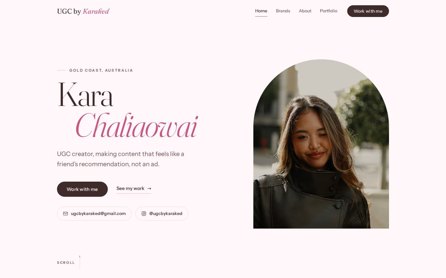
A one-page portfolio for Kara Chaliaowai, a Gold Coast UGC creator: her work, the brands she’s worked with, and how to book her.
- Client
- UGC creator portfolio
- Location
- Gold Coast
- Live site
- ugcbykaraked.com
01
The problem
Kara Chaliaowai is a UGC creator on the Gold Coast, making restaurant and product content for brands to run as their own. She posts as @ugcbykaraked on Instagram.
Brands buy UGC on the footage. Kara needed one link, for her bio and her pitches, that shows the work, the brands and how to book her.
02
The build
One page, six sections, in this order: hero, brands, analytics, about, portfolio, contact.
From skeleton to live site
01 Structure
The skeleton first: the nav, her name beside an arched portrait, and the ways to reach her (Work with me, email and Instagram).
02 Type
Then the words, in the site’s own faces and colours: Fraunces for her name, Chaliaowai in pink italic, Instrument Sans in brown.
03 Imagery
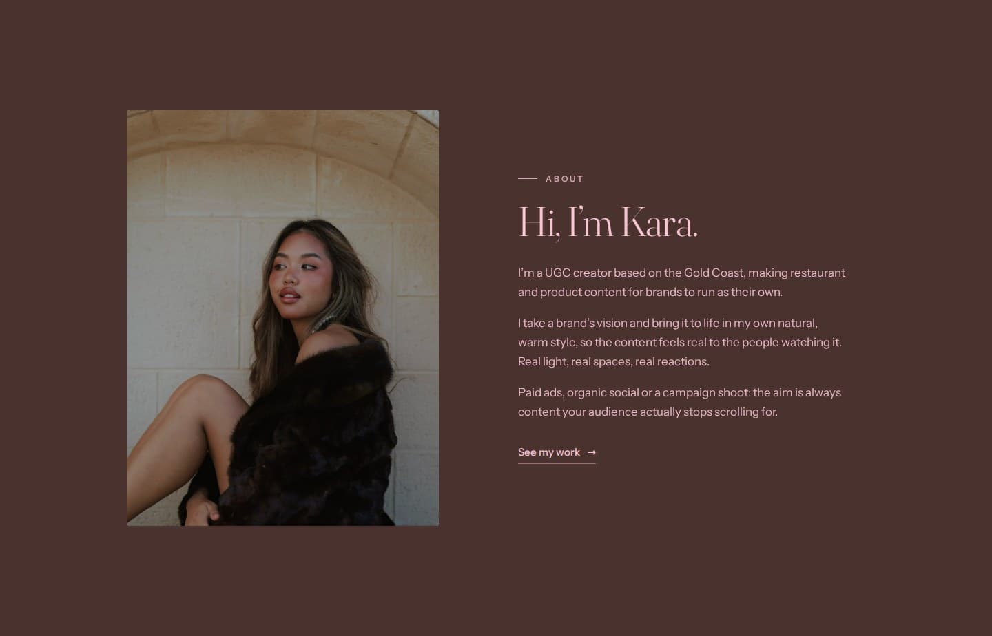
Then the photography: her portrait, set in the arch beside her name.
04 Live
Then it ships, on her own domain.
01
Straight to her inbox
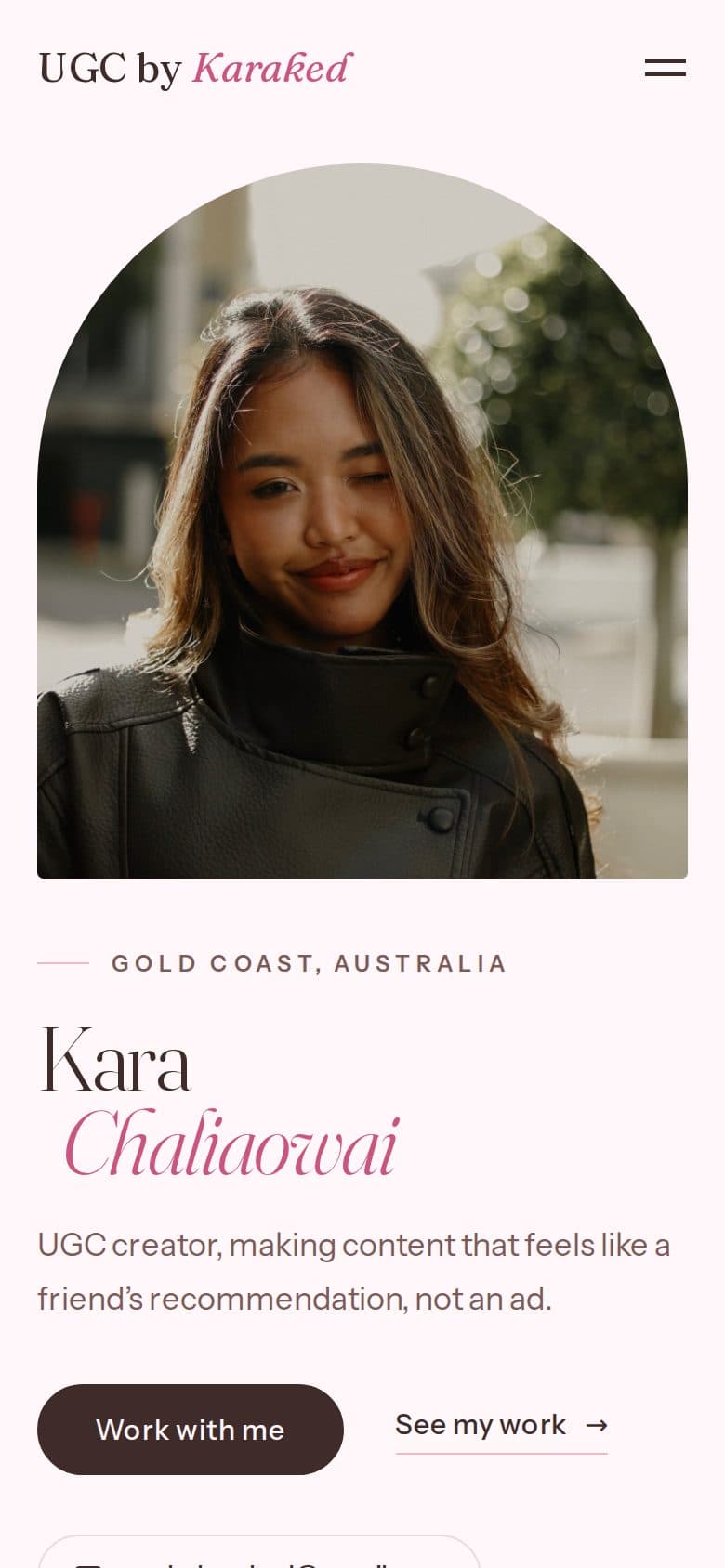
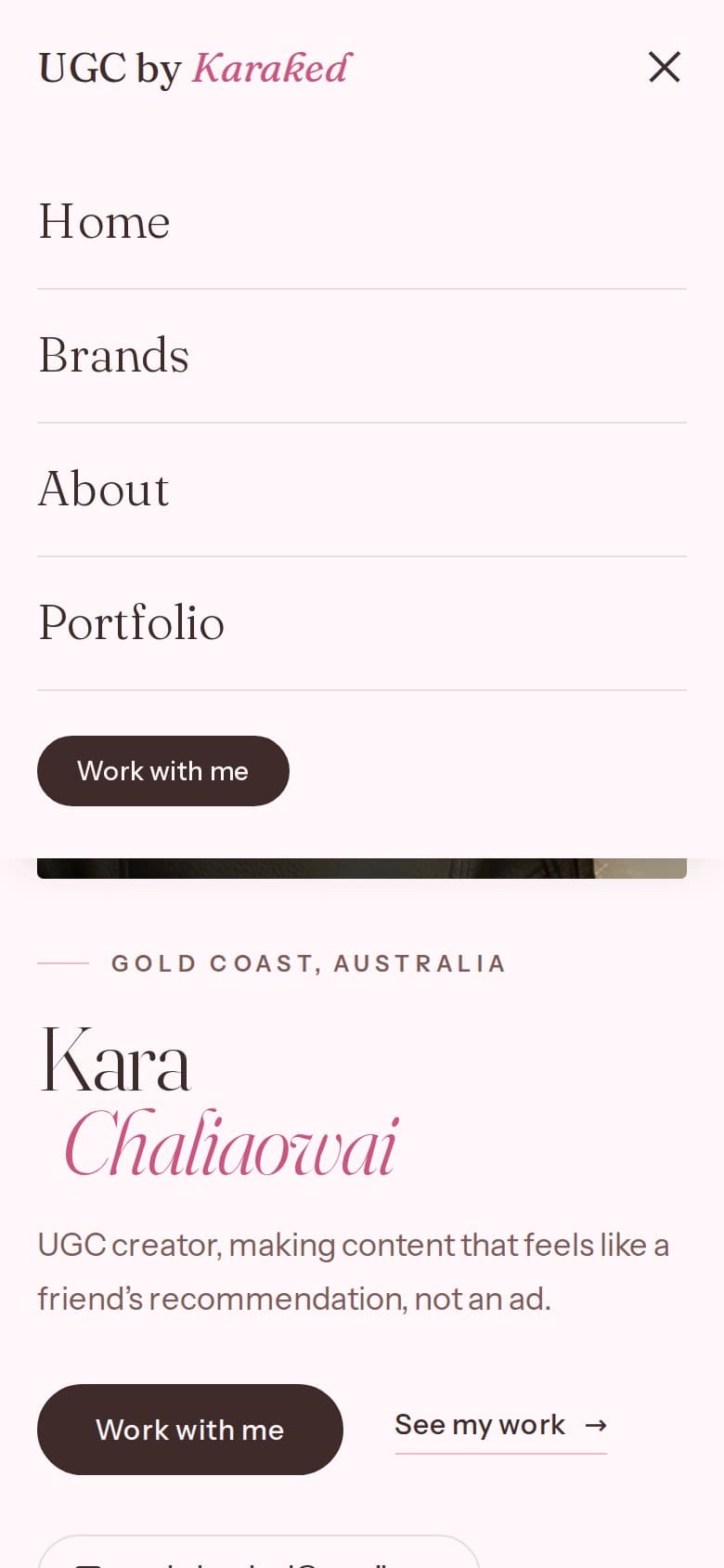
On desktop, the first screen is her name, one line on what she makes (“content that feels like a friend’s recommendation, not an ad”) and every way to reach her: a Work with me button, her email and her Instagram. On a phone, the portrait comes first, then her name and that line, with Work with me under them and in the menu.
02
Brands, in one ink
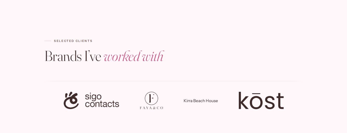
A “Brands I’ve worked with” marquee of six brands, each linking to its own site. Every logo is drawn in the page’s brown, and a brand with no logo file is set in type, as Kirra Beach House is today. The loop has no seam and pauses on hover or keyboard focus.
- Sigo Contacts
- Faya & Co
- Kirra Beach House
- Kost
- Fu Manchu Oriental
- Cabukee
03
Analytics, with receipts
Three figures, each tied to a source: two from Instagram Insights over a stated 30-day window, and a brand count taken from the brand list. A fourth tile lists where her content runs. The raw Insights screenshots sit underneath, cropped only to remove the phone’s own interface. The numbers are Kara’s to share, so this case study doesn’t repeat them.
- Paid social ads
- Organic brand content
- Websites & campaigns
04
About, on a dark panel
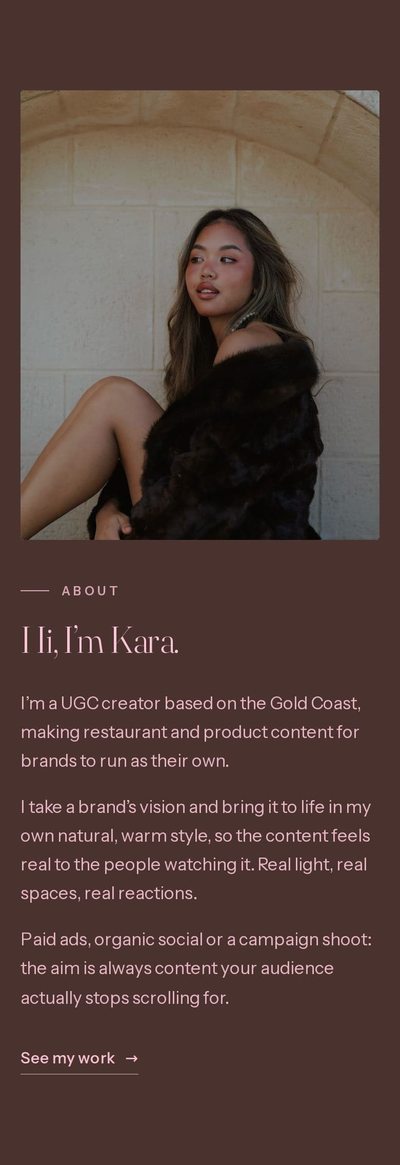
The About section inverts: a deep brown panel with pink type, her portrait against a sandstone archway, and three short first-person paragraphs.
05
Six pieces, three tabs
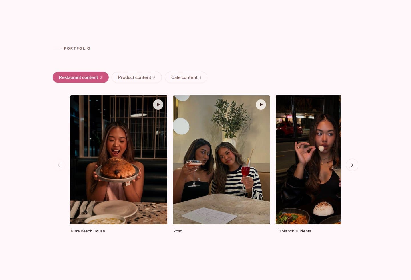
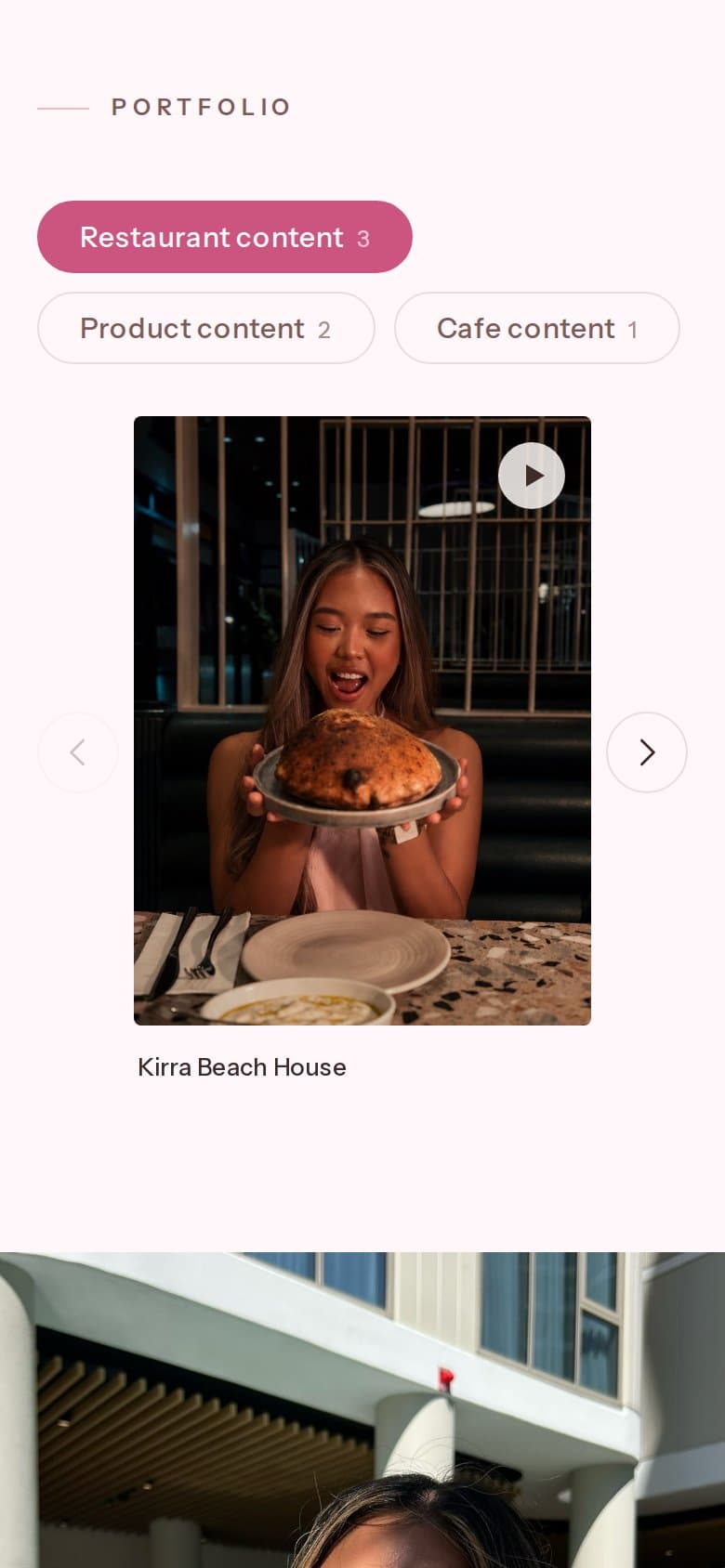
The portfolio is all video. Each tab holds a sideways-scrolling row of tiles with arrows either side, one tile to a screen on phones. The tabs are a real tablist, so the arrow keys move between them.
- Restaurant content: 3 pieces
- Product content: 2 pieces
- Cafe content: 1 piece
06
Tap to play
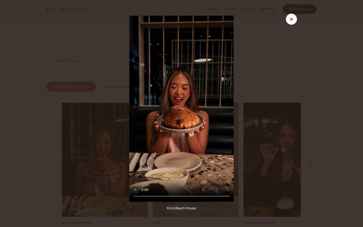
A tile opens its clip in a lightbox, with the video’s own controls and the brand as its caption. The ×, a click outside or Escape closes it.
07
Let’s work together
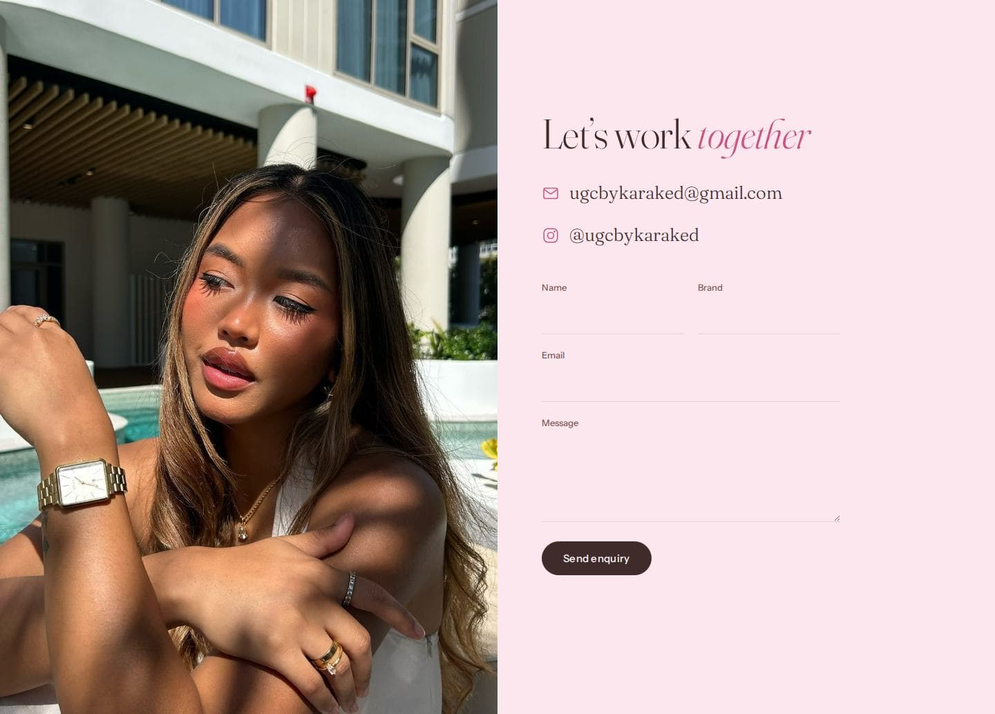
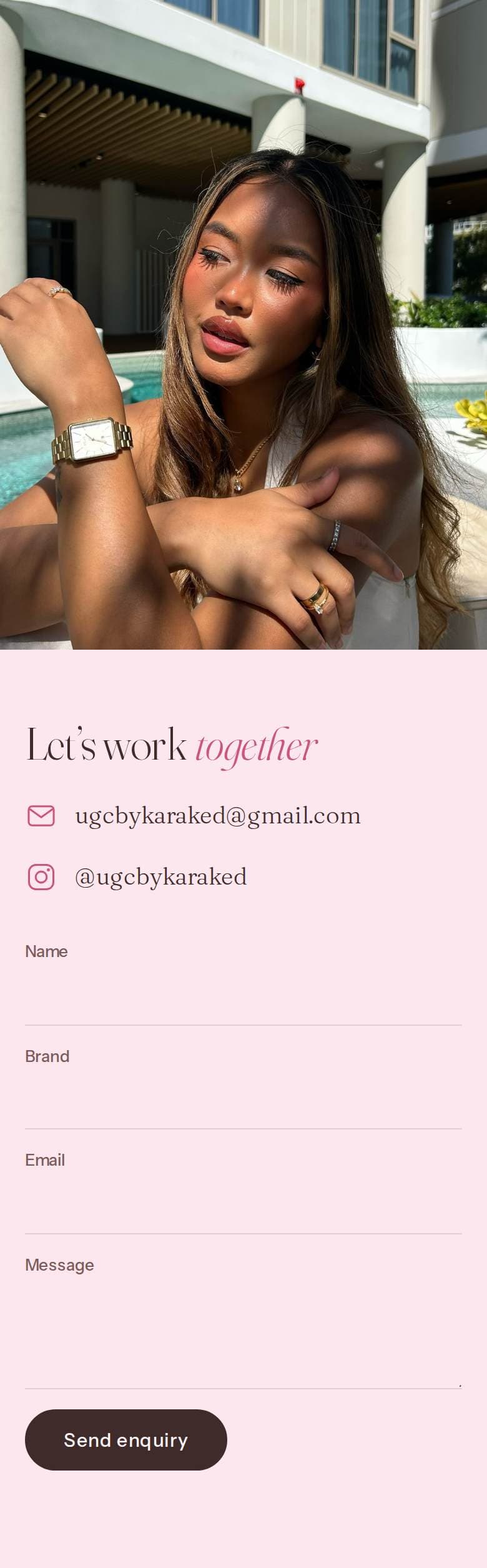
The page ends where the hero points: her email and Instagram again, and an enquiry form that lands in her inbox, where replying goes straight back to the sender. If sending fails, the visitor’s own email app opens with the enquiry already written.
- Name
- Brand
- Message
Built with
- Plain HTML, CSS and JavaScript
- No build step
- Hosted on Vercel
- Fraunces + Instrument Sans
- Blush palette, deep pink accent
- schema.org Person structured data
03
The result
Live at ugcbykaraked.
Her email and Instagram sit right under the hero’s Work with me button, and the enquiry form lands in her inbox.
Visit the site